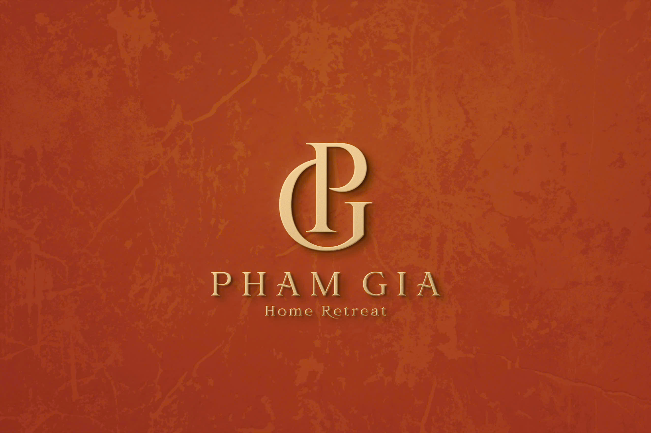


PHAM GIA
Pham Gia is a homestay brand known for its green spaces, harmonizing with nature to offer a tranquil and cozy retreat experience.
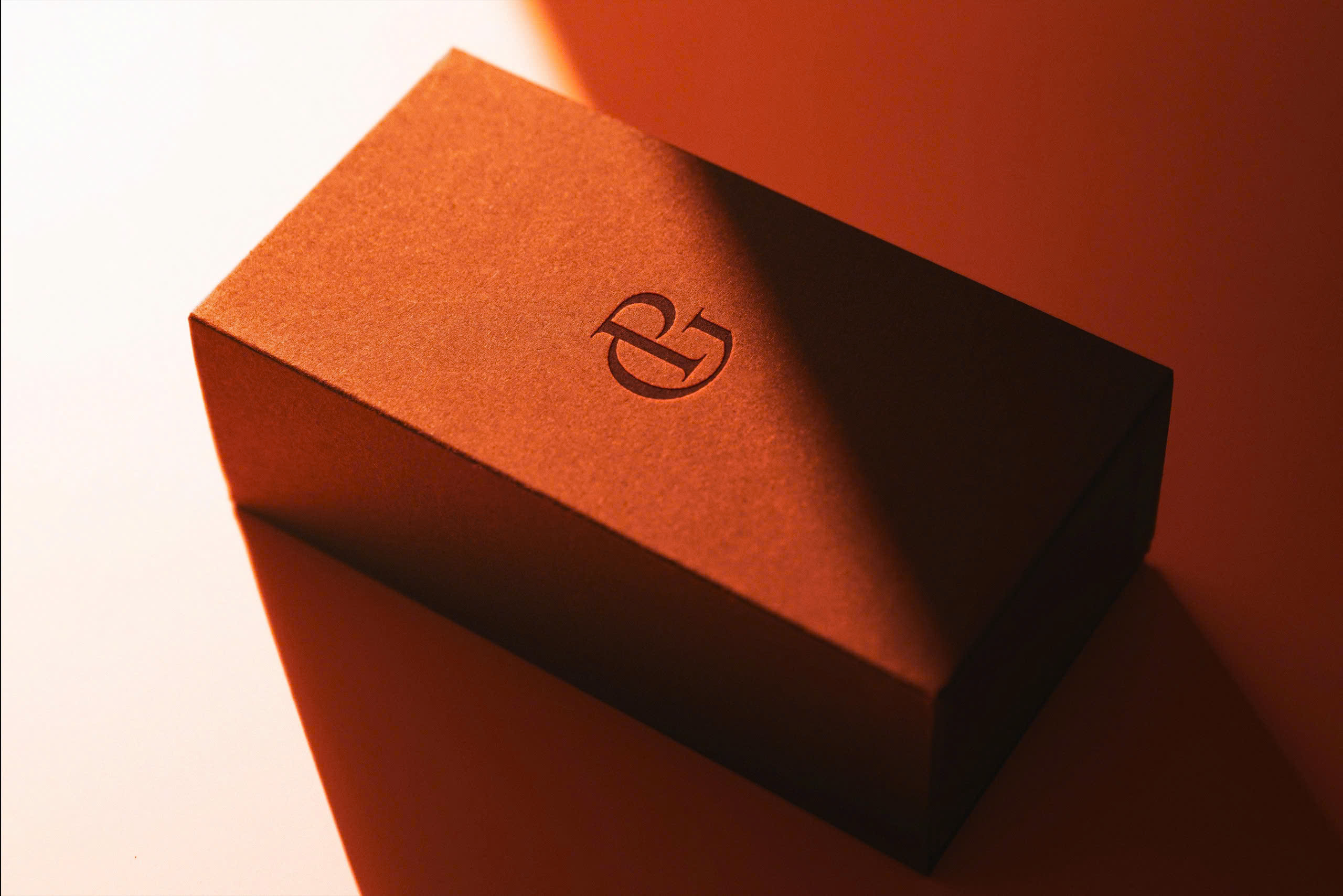
The logo symbol is designed by elegantly intertwining the letters “P” and “G,” representing a harmonious connection between people and nature, creating a distinctive brand identity.
The design style is classic and luxurious, featuring earthy orange and gold tones that evoke warmth, friendliness, and a touch of sophistication.
The highlight of the logo lies in its harmonious color palette and refined typography, emphasizing the brand’s values while conveying a sense of closeness and simplicity.
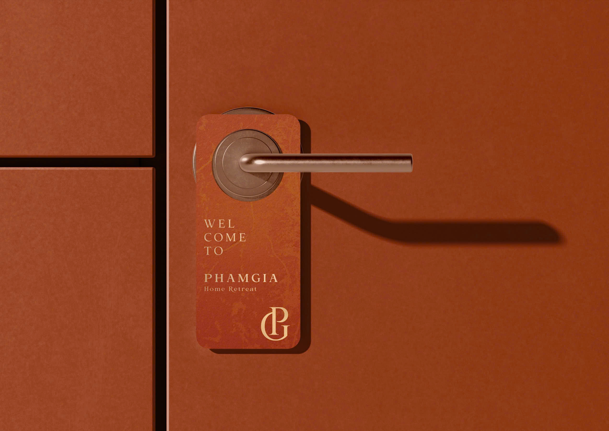
The logo is highly versatile, easily adaptable to various platforms, from signage and menus to digital materials, reinforcing Pham Gia’s position in the market.
- CLIENTTran Bich Tran
- INDUSTRYHomestay
- PERIOD9/2024


