


BOOK JUICE
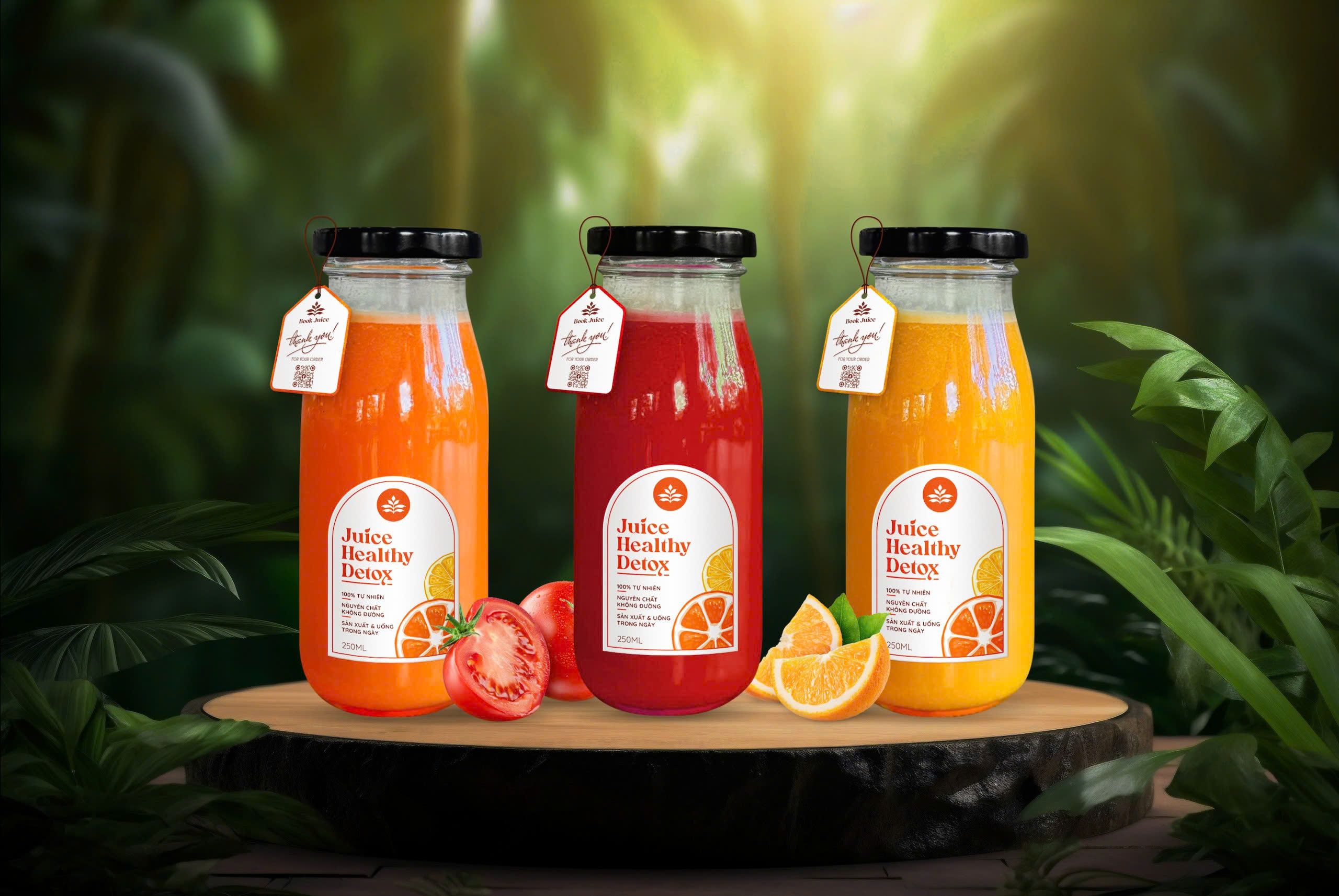
The packaging for the Book Juice brand is designed to stand out and make a strong impression on consumers at first glance. Inspired by the image of a book – a symbol of knowledge and discovery – the bottle labels and tags are creatively styled like unique book covers, turning each product into an engaging story on the shelf.
The packaging design is modern and innovative, combining vibrant tones with illustrations of fresh, juicy fruits to convey energy, freshness, and dynamism. Notably, the logo and messages on the packaging are presented clearly and legibly while maintaining a sense of sophistication.
What sets Book Juice’s packaging apart is its ability to evoke a unique connection between juice and the exploration of a health story with every bottle. This design not only highlights the product amidst competitors but also fosters a sense of familiarity and approachability for consumers.
The packaging creates a positive impact by not only capturing attention but also leaving a lasting impression, enhancing brand recall. It encourages customers to return and share their delightful experiences, contributing to the development of loyalty toward Book Juice.
- CLIENTLam Lieu
- INDUSTRYDrink
- PERIOD08/2024


