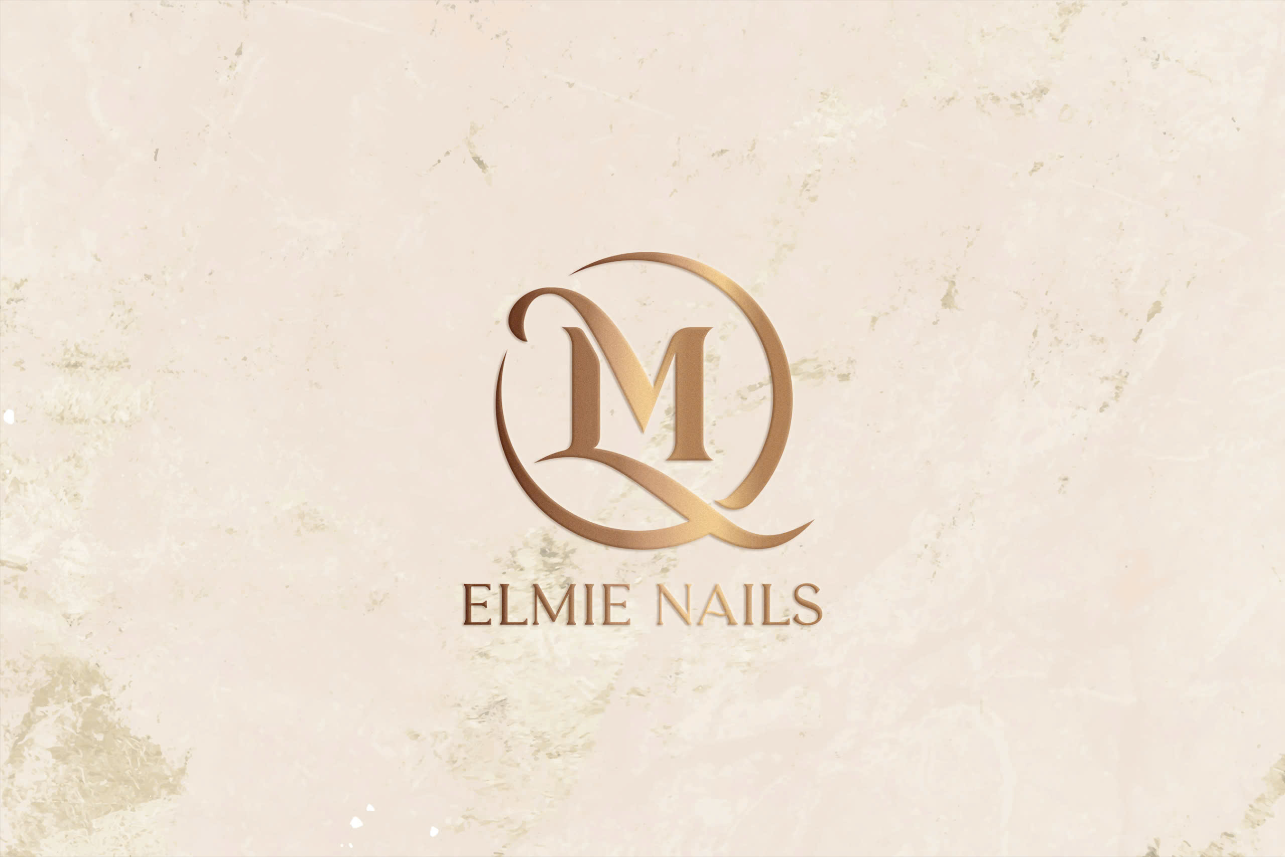

ELMIE NAILS
Elmie Nails is a brand specializing in providing a wide range of nail care and styling services for both hands and feet.
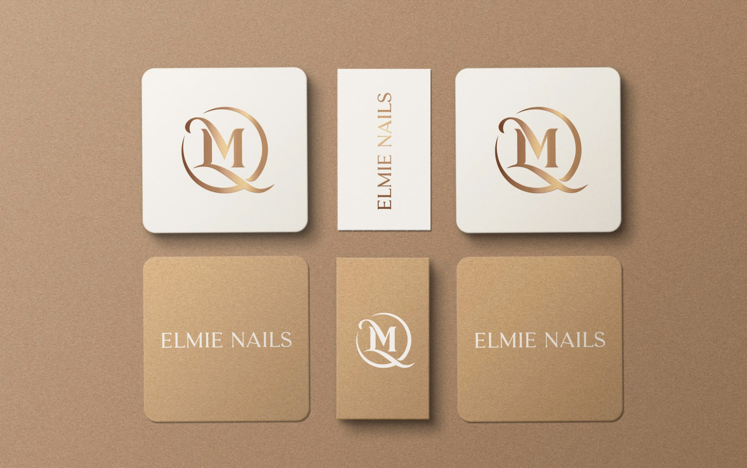
The logo is creatively designed with the concept of interlocking the letters “L” and “M” within a perfect circular layout, symbolizing connection and harmony—representing the brand’s elegance and professionalism.
The design style emphasizes sophistication and a classic touch, combined with modern elements to create a comfortable and friendly impression.
The highlight of the logo is the dominant brown tone, evoking warmth and reliability, enhanced by subtle metallic effects that add a luxurious feel. The font is sleek and easy to read, blending seamlessly with the emblem.
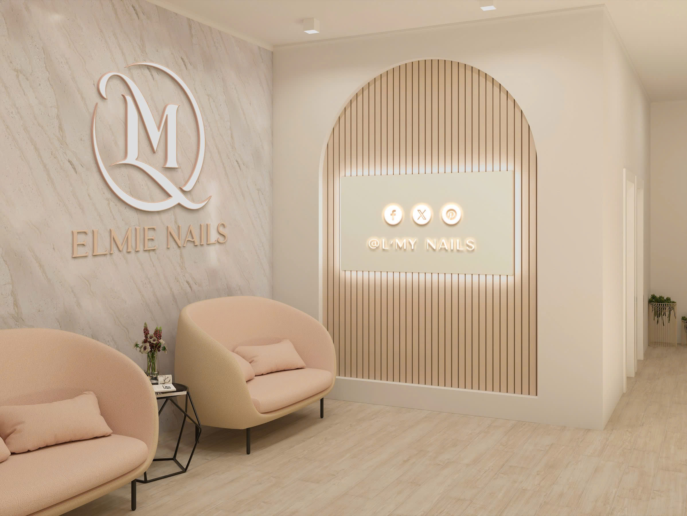
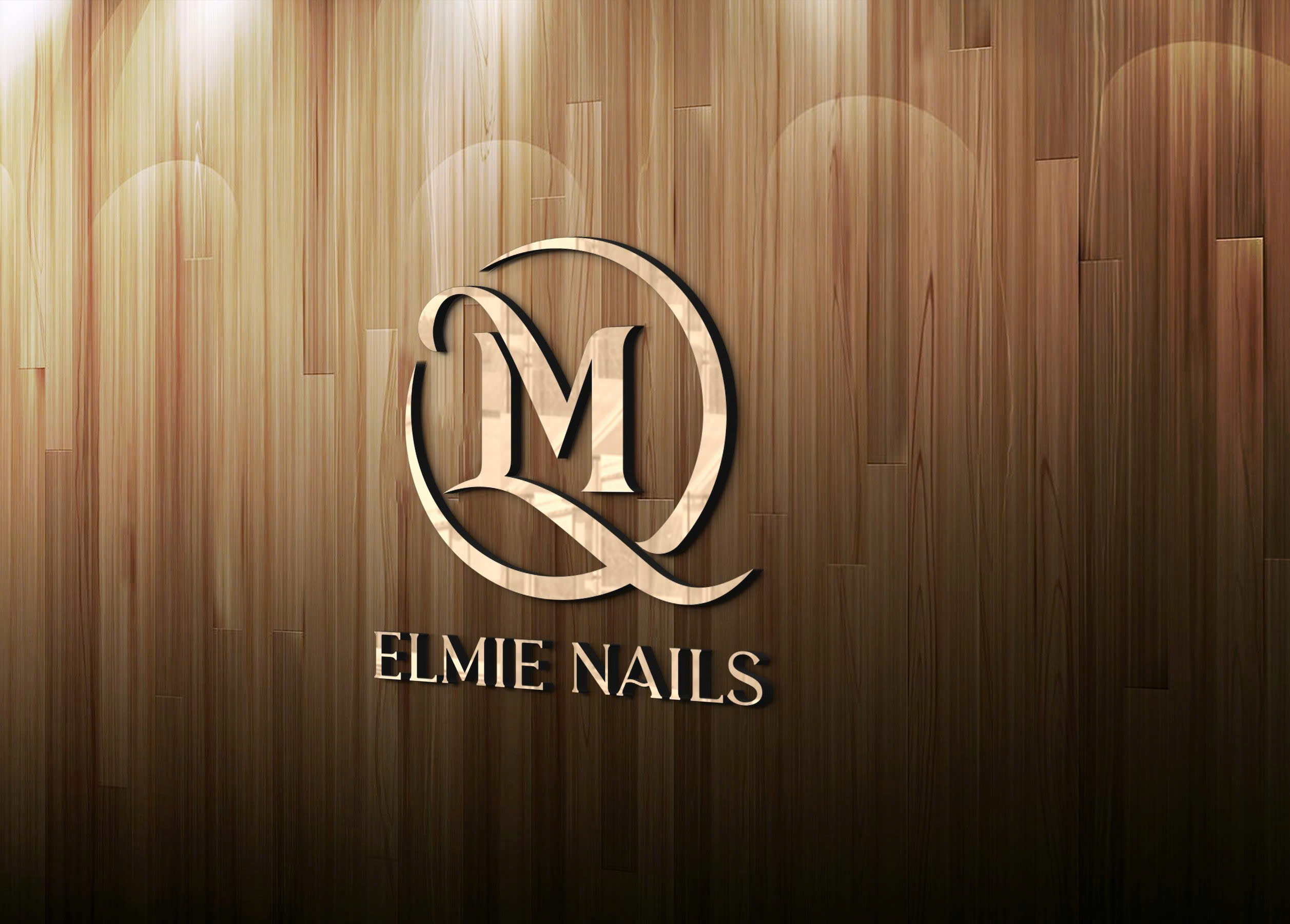
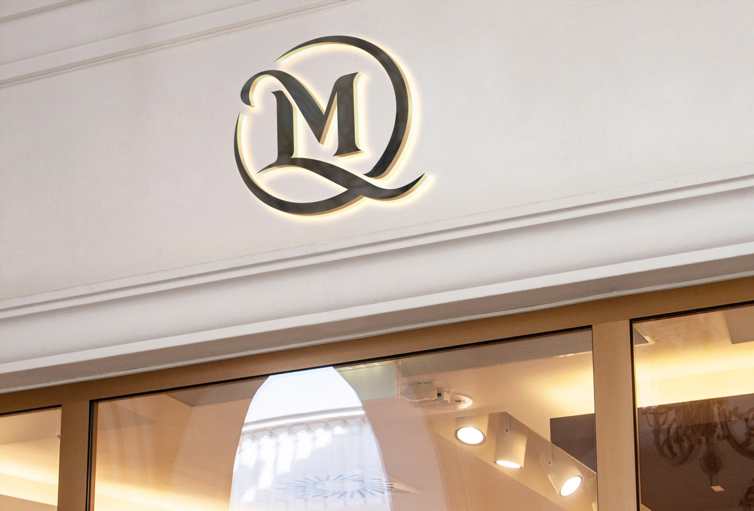
The Elmie Nails logo is highly versatile, easily adaptable across various platforms, from signage and product packaging to digital materials, ensuring consistent and professional brand recognition.
- CLIENTLinh
- INDUSTRYNails
- PERIOD09/2024


