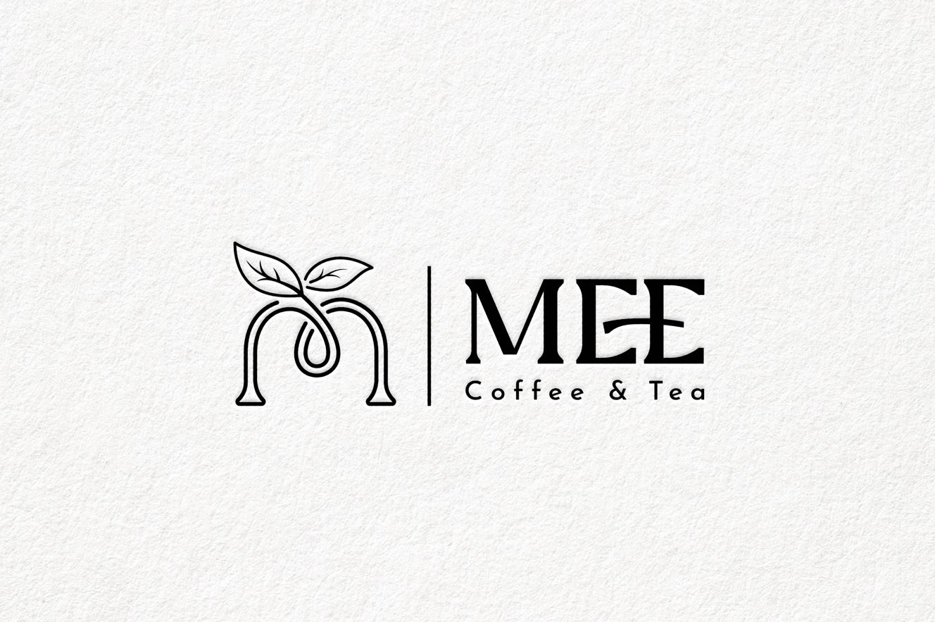
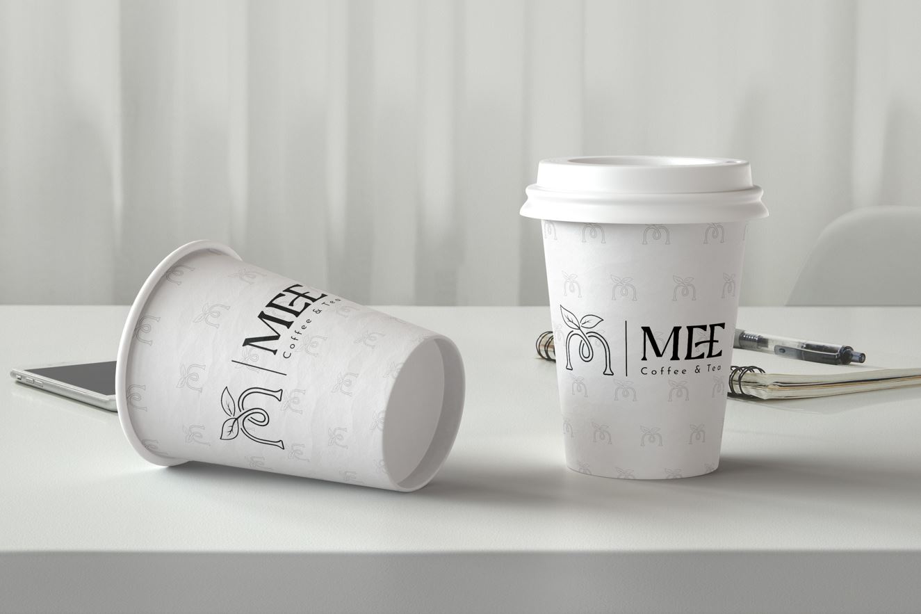
MEE COFFEE
Mee is a brand specializing in coffee, offering high-quality, naturally inspired beverage experiences.
The logo features a stylized tea leaf shaped into the letter “M,” symbolizing the connection between nature and humanity in every Mee product.
The design adopts a minimalist yet modern style, utilizing a contrasting black-and-white color palette to convey sophistication and professionalism.
The standout feature of the logo lies in the soft tea leaf symbol and elegant typography, creating a sense of warmth while maintaining a touch of luxury.
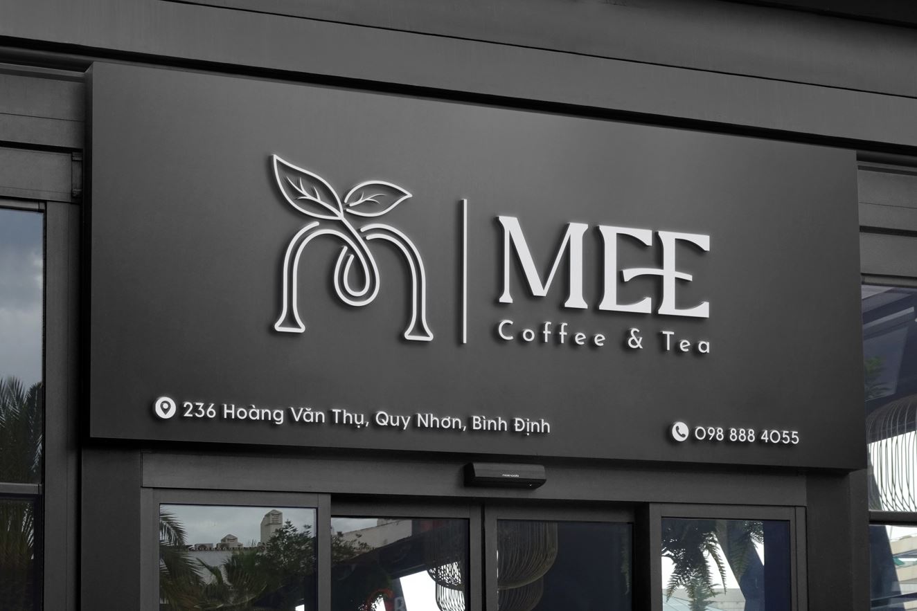
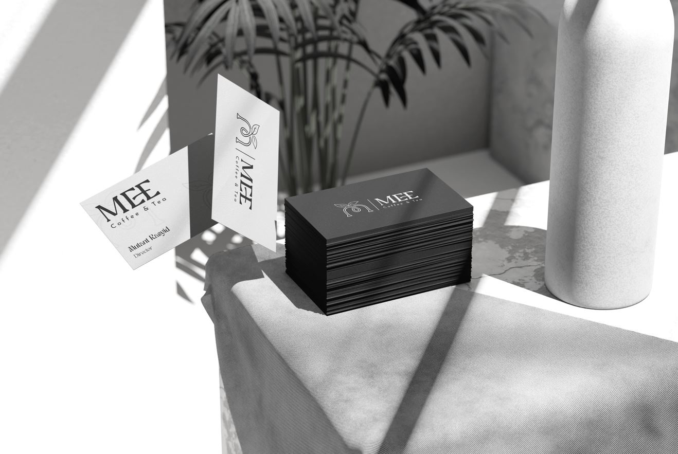
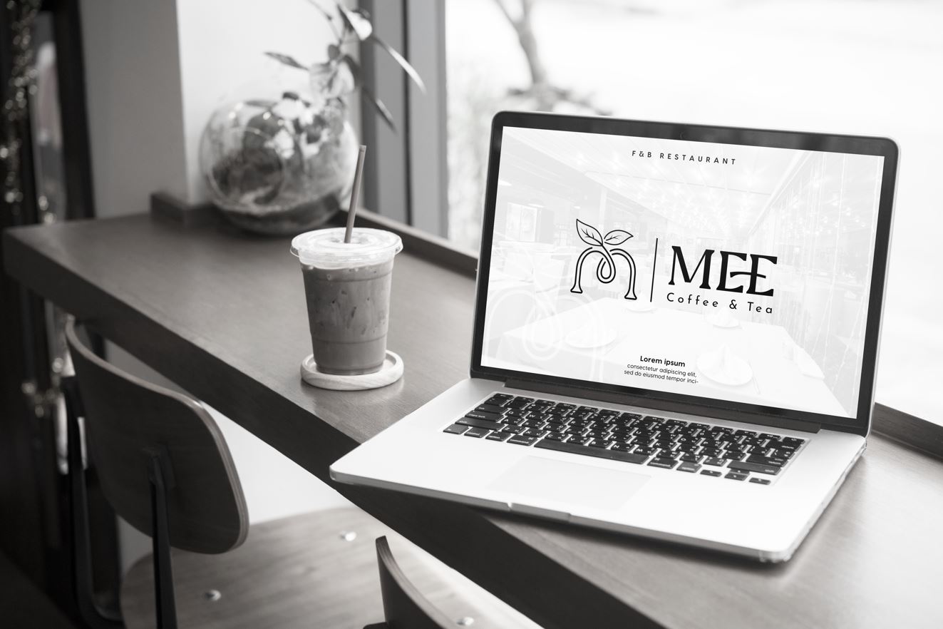
The logo is highly versatile, seamlessly adapting to various platforms such as product packaging, store signage, and digital materials, ensuring a strong and lasting impression for the brand.
- CLIENTMrs. Nhu Nguyen
- INDUSTRYCoffee
- PERIOD2024


