


NHON HOI QUY NHON
Nhon Hoi Quy Nhon is a leading brand in the production and distribution of cement, committed to delivering sustainable quality and exceptional reliability.
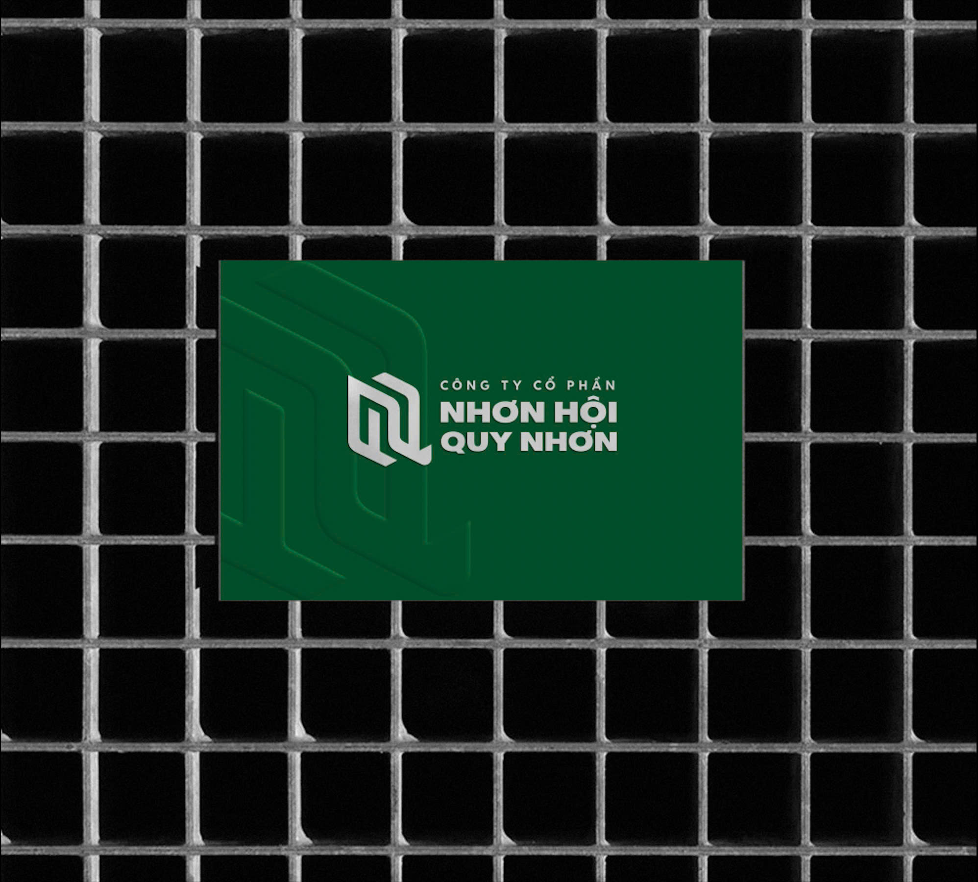
The logo symbol is creatively designed by skillfully intertwining the letters “N” and “Q,” representing cohesion and solidity, symbolizing the company’s core focus in the construction industry.
The design style is modern and minimalist, emphasizing strength and professionalism, perfectly aligned with the construction industry’s demands.
The standout feature of the logo is the combination of silver tones (evoking the durability of cement) and deep green (representing sustainable growth), paired with clear typography that conveys trustworthiness and professionalism.
The logo is highly versatile, seamlessly appearing on various platforms such as product packaging, construction site signage, cement trucks, and digital media, ensuring strong and consistent brand recognition in the market.
- CLIENTDieu Mo
- INDUSTRYConstruction Materials
- PERIOD10/2024


